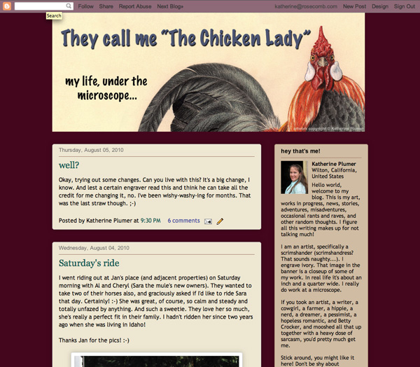
Here's what it looked like a few days ago:

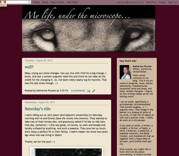
And then I changed it to this:

I really liked that template a lot until I changed the banner, and then I didn't think the template worked with the new look.
Ack!
Maybe that shouldn't be a comma in the title? A semicolon? Nothing? Another dot dot dot?

I like the color scheme.
ReplyDeleteLove the changes!
ReplyDeleteI like the comma, but you could try 3 dots there too to see what it looks like. I don't suggest a semi-colon or no punctuation at all. It's really striking!
ReplyDeleteJann
I meant try 3 dots instead of the comma, of course.
ReplyDeletechicken on the sidebar = good. Change = okay, but reminds me a lot of pointalism or stippling...but is that not what scrimshaw is? -BMC
ReplyDeleteNekkid Chicken, Jim, Jann, thanks!
ReplyDeleteI think the comma might be better. I tend to overuse "..." anyway.
BMC- que? That is a scrim image in the banner, sooo.... I'm not sure what you mean.