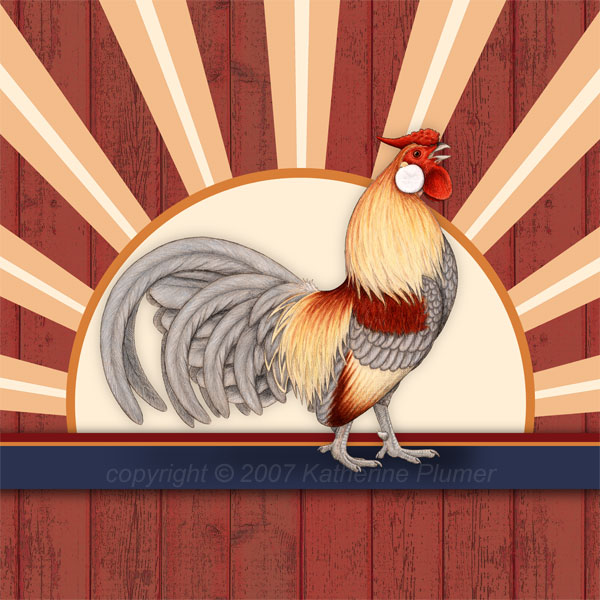
Sorry if I'm driving you crazy with this image but this really is a great way to get some input, which I really value! So someone mentioned "off centering" the bird to actually make him look more centered... like since birds don't have their legs smack dab in the middle, even though as a whole from front to back he was centered, he wasn't standing in the middle.
Still isn't standing right in the middle, but I moved him back a bit. What say you? Better? Worse?

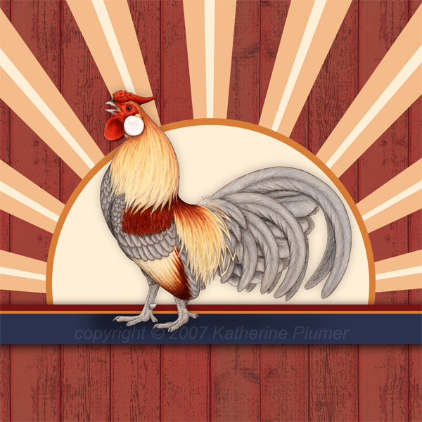
And just to satisfy the curiosity, here's a flipped one.


Nice call JJ!
ReplyDelete