So I have this commission I'm just starting for an illustration of a perfectly colored and marked feather from a particular breed of chicken. This is very "Standard-like" but is a private job for an individual person, not for any organization. Same rules apply though... "gotta be perfect." (yeah, no pressure or anything).
In non-chicken-person terms, it's basically a brown feather with black markings. There are a gazillion and a half different shades of brown (in poultry and otherwise) and this particular one is described as "bright reddish mahogany." Without looking in glossaries, in my mind that is darkish reddish brown, but high in color saturation, hence the brightness.
Other birds with similar shades of brown are described as "rich mahogany brown", "rich dark chestnut mahogany", "rich mahogany bay", "mahogany bay", and "deep reddish bay". Yup, each one is a little different, but very similar.
There are two different organizations in the poultry world, and each one publishes a "Standard".. a book that explains the ideal of every color and every breed, and it is by these Standards that the birds are judged. So if a show is sanctioned by both clubs, and the birds are to be judged under both standards, but judged only once, the standards ought to agree, right?
Hmm, yeah they don't. In some parts, yes, but not everywhere. I ran into a problem with this when I was doing the Standard illustrations, I was referencing the book from the other club, which had a different description, and I ended up having to redo one. Ack!
Now, I will say I do not have the most current edition of the bantam standard, so perhaps things have changed, but looking at the glossaries of both books just to clarify color, here is what I find:
BAY:
APA: light golden brown
ABA: reddish brown, color of ripe horse chestnut
MAHOGANY:
APA: deep glowing reddish brown
ABA: brownish yellow hue, medium saturation, low brilliance (to which red is included)
CHESTNUT:
APA: dark red-brown, darker than bay
ABA: brown; yellow-red in hue, medium saturation, medium brilliance
Oh come on, that's just ridiculous! [grumbles] I'm just going to do what I think is right. Psh!
(RJ if you are reading this the grumbles aren't at you, they're at the SOPs!) ;-)
Sunday, June 24, 2007
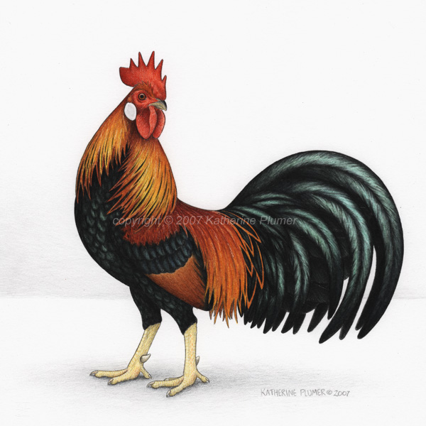
Light Brown Leghorn rooster done
Friday, June 22, 2007
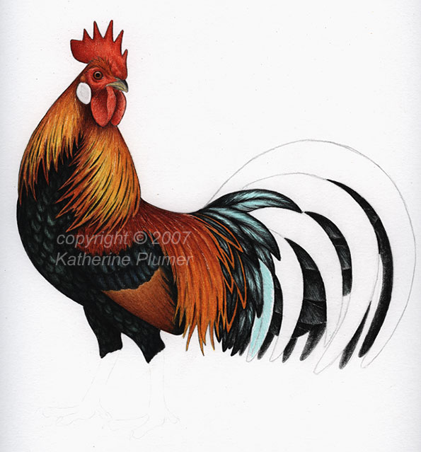
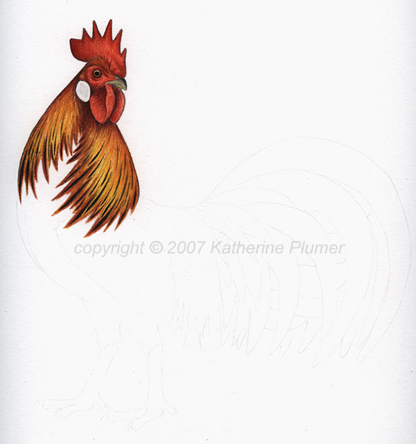
June 22 work in progress
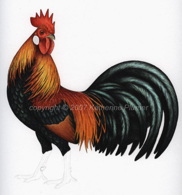
Finishing the feet would be helpful... I *could* finish it tonight but knowing I have a bunch of stuff to do in the morning made me decide against that, since it would involve working til the wee hours.
I'll stick a shadow in there too. This is going to end up a digital piece (a la Wakeup Call) but the chicken-on-paper will be available for sale (price TBD). The digital aspect of this particular one is fairly complex and I'm not exactly sure of the composition, so it'll take a while. Not next week.
it goes to show...
That you never know! About a month ago I entered three art pieces in State Fair (which is not til August/September). I've been not as impressed with the equine art division the last couple years so I entered "The First of Spring" and "Levade." Also on a whim entered the somewhat controversial "Proud Heritage" in the drawing category. State Fair is a really tough show to get into. I've only managed it twice before.
Well, got my letters today. Two no, one yes. OMG, "Proud Heritage" got in!!!! Wow! You never know! ;-) Hmm, that gives me three weeks to get it framed. Ooh, that's not going to be cheap. :-/
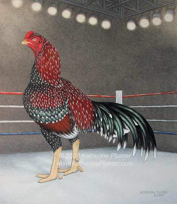
"Proud Heritage" accepted
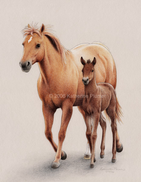
"The First of Spring" not accepted
"Levade" not accepted

Well, got my letters today. Two no, one yes. OMG, "Proud Heritage" got in!!!! Wow! You never know! ;-) Hmm, that gives me three weeks to get it framed. Ooh, that's not going to be cheap. :-/
"Proud Heritage" accepted

"The First of Spring" not accepted

"Levade" not accepted

Thursday, June 21, 2007
chicken pics!
I have not posted chicken pics for quite some time, so today I shall subject you to that. :-)
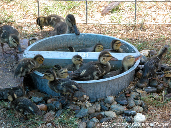
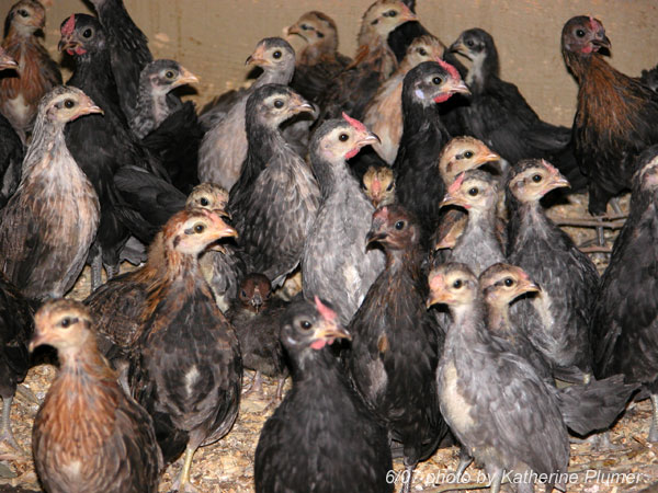
The youngest three batches from the 2007 season, yup some real size variation in three weeks!
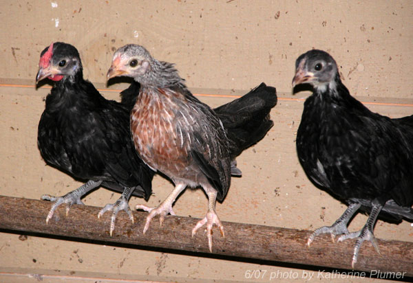
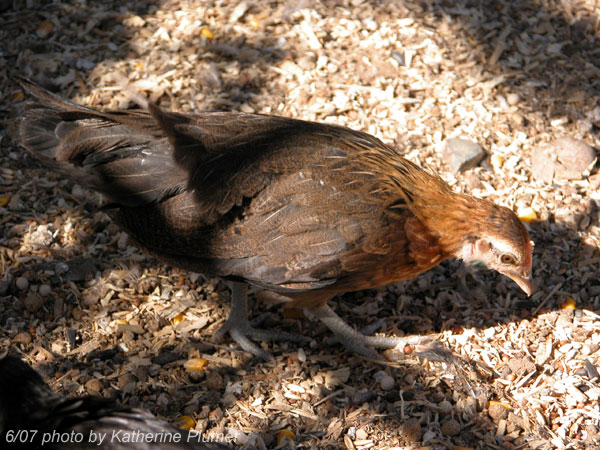
One of the Something Duckwing pullets (between two Blacks). Probably she's Golden Duckwing... There is a younger one with dark legs but this one has better color.
The BEST BBRed color I have seen on a pullet, EVER. As luck would have it, she's single combed. Even worse, she's from the Duckwing breeding pen and therefore only 75% Rosecomb (so potentially going to have non-white ear lobes, dang it!) Time will tell.
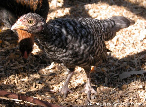
A Cuckoo pullet. Still thoroughly unimpressed with them but again, time will tell.
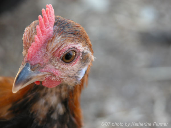
Hey, that's a.... If you said purebred BBRed Rosecomb you'd be right. If you said what the heck that's a single comb, right again. Amazing how that gene persists! I know both the Brown Red breeding stock males carry it...
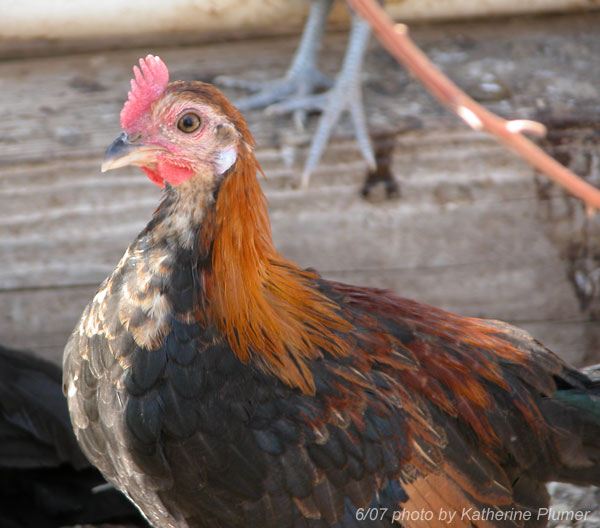
A birchen-ish pullet from the Duckwing pen. Hmm, that may end up being an inverted spike. Ugh.
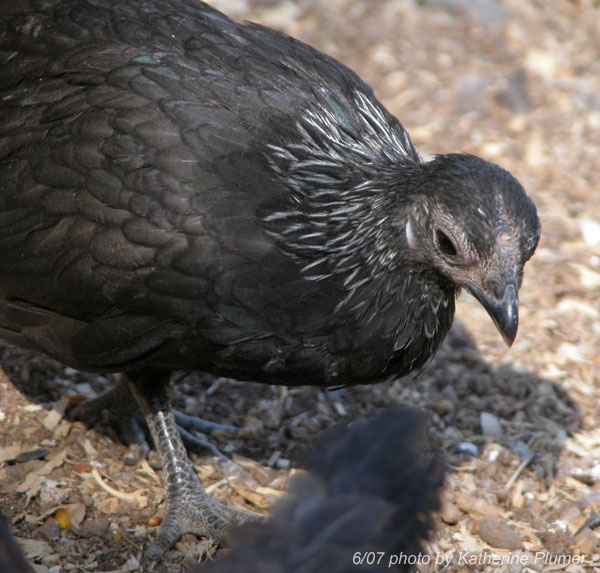
Fairly decent colored Blue Red male (again, from the Duckwing pen, go figure!) The ear lobes are questionable, with him being 25% Old English...
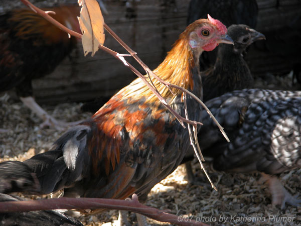
"Granpda" Eddie. He lives with the youngsters, as he's very docile. Eddie hatched in 1996. He is my oldest bird, and the oldest bird I've ever owned. And he looks OLD but he's still very spry and doing well!
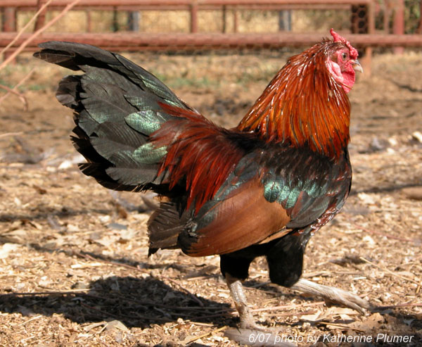
This was Eddie in 1997, Reserve of Breed at PPBA! Hard to believe he was that good, and AMAZING how much my BBReds have changed. Every one of them traces its ancestry back to Eddie, so he's pretty special to me. :-)

The youngest three batches from the 2007 season, yup some real size variation in three weeks!

One of the Something Duckwing pullets (between two Blacks). Probably she's Golden Duckwing... There is a younger one with dark legs but this one has better color.

The BEST BBRed color I have seen on a pullet, EVER. As luck would have it, she's single combed. Even worse, she's from the Duckwing breeding pen and therefore only 75% Rosecomb (so potentially going to have non-white ear lobes, dang it!) Time will tell.

A Cuckoo pullet. Still thoroughly unimpressed with them but again, time will tell.

Hey, that's a.... If you said purebred BBRed Rosecomb you'd be right. If you said what the heck that's a single comb, right again. Amazing how that gene persists! I know both the Brown Red breeding stock males carry it...


A birchen-ish pullet from the Duckwing pen. Hmm, that may end up being an inverted spike. Ugh.

Fairly decent colored Blue Red male (again, from the Duckwing pen, go figure!) The ear lobes are questionable, with him being 25% Old English...

"Granpda" Eddie. He lives with the youngsters, as he's very docile. Eddie hatched in 1996. He is my oldest bird, and the oldest bird I've ever owned. And he looks OLD but he's still very spry and doing well!

This was Eddie in 1997, Reserve of Breed at PPBA! Hard to believe he was that good, and AMAZING how much my BBReds have changed. Every one of them traces its ancestry back to Eddie, so he's pretty special to me. :-)

Wednesday, June 20, 2007
June 20 work in progress
Tuesday, June 19, 2007
Monday, June 18, 2007
random pics of the day
Sunday, June 17, 2007
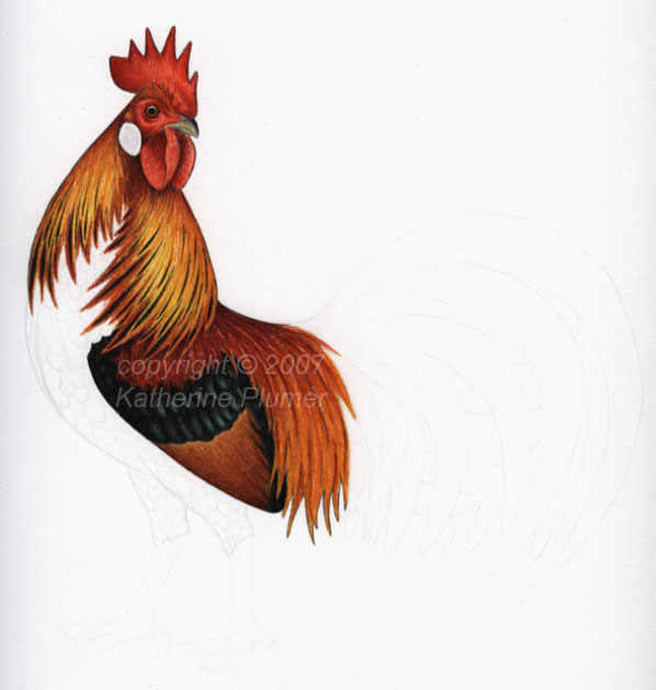
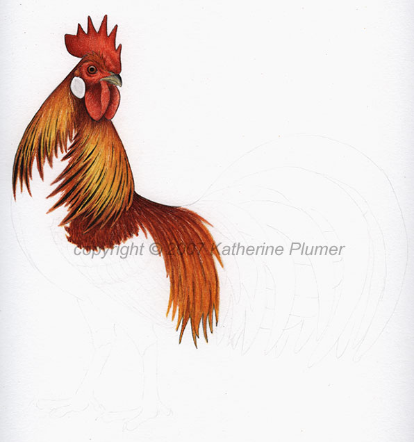
June 17 work in progress
I'm still here... I haven't been posting much art because I've mostly been doing website work for the last few days. Not my site, but one of the other ones I run is getting a total overhaul, and it's hugely complicated and a lot of work. I'll post more info when that's done, it'll be worth seeing. :-)
Anyway, "The Wakeup Call" is pretty much done. Consensus was that the off-centered bird was better, so I'll stick with that. Thanks for the input. Now I just need to sort out what to *DO* with it! ;-)
I have started on the next mixed media digital thing. First step of course is the drawing. I had expressed interest in a game rooster but I was a little worried about public perception, so I've settled on a Brown Leghorn type of rooster. I say "type of" because I'm really trying not to get overly hung up on STANDARDS. Really, I've had quite enough of that. ;-) So, I want him to be something that fanciers will look at say "that's a Light Brown Leghorn" but that the general public will appreciate as "classic barnyard rooster."
Didn't get too far on that today but I have a other things sketched out too (not posted).
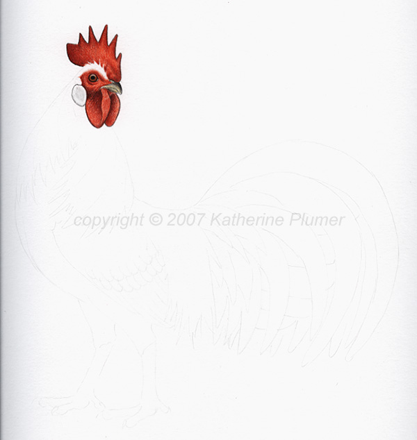
bird is about 8x8.5 or so
colored pencil, graphite, ink
on white Rising Stonehenge paper
Anyway, "The Wakeup Call" is pretty much done. Consensus was that the off-centered bird was better, so I'll stick with that. Thanks for the input. Now I just need to sort out what to *DO* with it! ;-)
I have started on the next mixed media digital thing. First step of course is the drawing. I had expressed interest in a game rooster but I was a little worried about public perception, so I've settled on a Brown Leghorn type of rooster. I say "type of" because I'm really trying not to get overly hung up on STANDARDS. Really, I've had quite enough of that. ;-) So, I want him to be something that fanciers will look at say "that's a Light Brown Leghorn" but that the general public will appreciate as "classic barnyard rooster."
Didn't get too far on that today but I have a other things sketched out too (not posted).

bird is about 8x8.5 or so
colored pencil, graphite, ink
on white Rising Stonehenge paper
Wednesday, June 13, 2007
The Wakeup Call... again...
Sorry if I'm driving you crazy with this image but this really is a great way to get some input, which I really value! So someone mentioned "off centering" the bird to actually make him look more centered... like since birds don't have their legs smack dab in the middle, even though as a whole from front to back he was centered, he wasn't standing in the middle.
Still isn't standing right in the middle, but I moved him back a bit. What say you? Better? Worse?
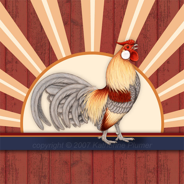
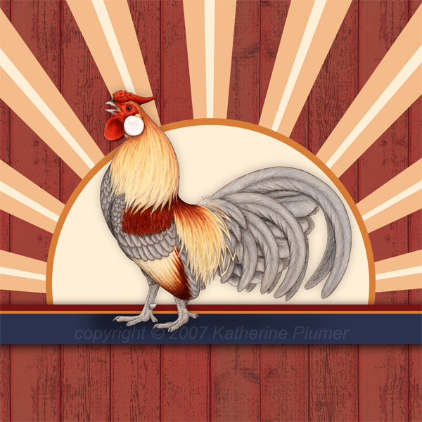
And just to satisfy the curiosity, here's a flipped one.
Still isn't standing right in the middle, but I moved him back a bit. What say you? Better? Worse?

And just to satisfy the curiosity, here's a flipped one.

Levade
Tuesday, June 12, 2007
"The Wakeup Call" (revised)
I made a few revisions.
"The Wakeup Call" a mixed media image incorporating traditional drawing as well as digital photography and digital painting, is the first in a series of chicken art pieces designed specifically for licensing. Easily cropped to square, horizontal, vertical, or round formats, and with background elements that can be changed to suit the individual product, this image will fit any product.
With or without background parts, facing right or left, it's all still "The Wakeup Call." Just consider it flexible. I am uploading just the cropped-square versions for you to see. It can also be cropped in a multitude of other ways.
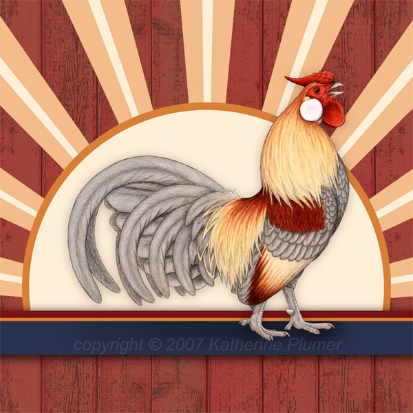
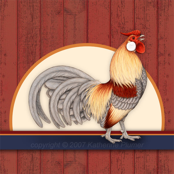
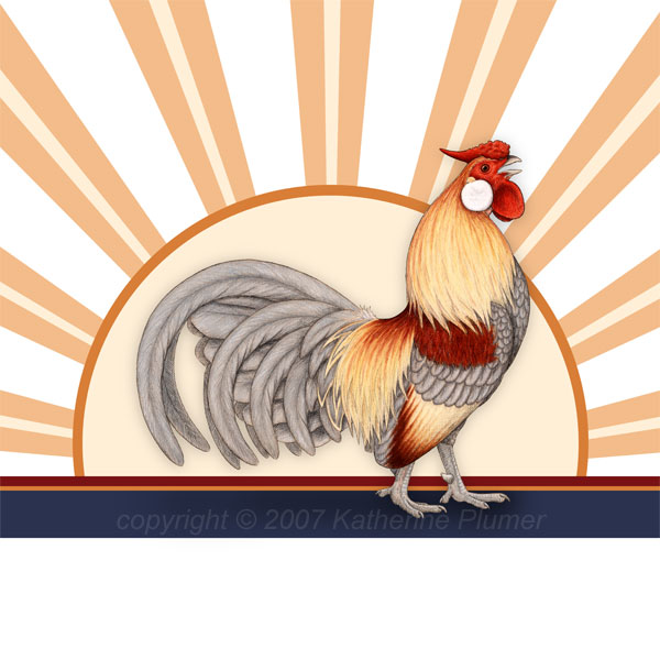
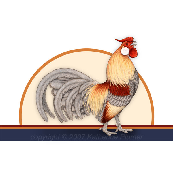
There will be a least four more in this series, created in a similar manner. I must say this one came to mind most easily, and the others present some unique challenges. As a "chicken snob" I get pretty hung on the breed! The next one will be another rooster. I want something proud and tough and immediately thought Old English or American Game. But I think for public appeal I need to create a very traditional looking bird with a single comb.. so I guess it'll be an undubbed Game. Lol. Can't please everyone. ;-)
"The Wakeup Call" a mixed media image incorporating traditional drawing as well as digital photography and digital painting, is the first in a series of chicken art pieces designed specifically for licensing. Easily cropped to square, horizontal, vertical, or round formats, and with background elements that can be changed to suit the individual product, this image will fit any product.
With or without background parts, facing right or left, it's all still "The Wakeup Call." Just consider it flexible. I am uploading just the cropped-square versions for you to see. It can also be cropped in a multitude of other ways.


There will be a least four more in this series, created in a similar manner. I must say this one came to mind most easily, and the others present some unique challenges. As a "chicken snob" I get pretty hung on the breed! The next one will be another rooster. I want something proud and tough and immediately thought Old English or American Game. But I think for public appeal I need to create a very traditional looking bird with a single comb.. so I guess it'll be an undubbed Game. Lol. Can't please everyone. ;-)
*sigh*
It's days like today when I wonder what I'm doing, and why I'm doing what I'm doing. My car is in the shop with a cracked radiator, bad brakes, and a transmission problem. It's had the transmission problem for years, and that'll just stay how it is (cross your fingers that it lasts another few years!), but the other things are getting fixed, and as you can probably guess, that's really expensive, and I hate spending money on a car I've been driving since I got my drivers license...
It's days like today when things feel doomed, when I am most painfully aware that other people my age have bought houses. Houses. And I can barely afford to get my car fixed. If I wasn't such a hard headed stubborn person I would have given up art a long time ago. But I can't. I won't. But why? It would probably be the smart thing. I guess it's because its the only thing I've always wanted to do, still want to do, must do...have to do. I've even wondered if I missed something, was there something else I was supposed to do in life? Did I miss a calling of some sort? No.. I think I'm destined for art. Doomed for art, lol! :-)
This seals the deal that I am not going to my high school reunion. I can put that ninety bucks to much more urgent use.
I dunno, this isn't something I talk about often and I may end up removing this posting, but lest anyone think that I'm some wildly successful artist, let me set the record straight. I'm hanging on by a thread.
I'm posting more stuff for sale.
*sigh*
Clap your hands if you believe in artists, I need it.
Sunday, June 10, 2007
The Wakeup Call
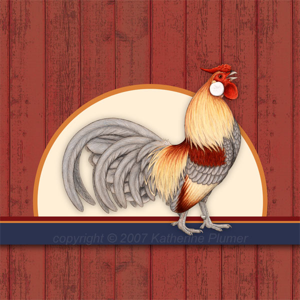
Alrighty, I have finished the first in a series (of at least five) of the digital mixed media (not sure that's the correct term) chicken art. Heading off into new and uncharted lands.. uncharted by me anyway. I've had a hard time trying to explain this, but it is the drawing I just finished (the one I titled "Barnyard Gem") placed into a digital setting. So other than the chicken itself, there is no original. It's all digital, and it's highly flexible in terms of shape. Why? It is designed specifically for licensing out onto a multitude of products. There will be prints available. I need to talk to my mentor to figure out how to proceed with the marketing. But, the "original" piece is done so that's a step in the right direction.
"The Wakeup Call"
digital mixed media incorporating colored pencil/graphite drawing


EDIT: I may even like this simple version better. Input??
"The Wakeup Call"
digital mixed media incorporating colored pencil/graphite drawing


EDIT: I may even like this simple version better. Input??

Friday, June 08, 2007
second place, yay!
I spent the day at Horse Expo with J.C.. I have never seen so much horsie naughtiness in one place before: bucking, spooking, unseating riders, loose stallion vs unappreciative mare, ambulances (I hope that person is okay...) It was wild, there must have been something in the air. This photo pretty much sums up the day, these two horses (Bashkir Curly) HAD riders when they entered the arena..oops!

The good news though is that my artwork placed second in the Colored Pencil category, yay! That's way cool. So here's my cheesy pose with my drawing.


The good news though is that my artwork placed second in the Colored Pencil category, yay! That's way cool. So here's my cheesy pose with my drawing.

Thursday, June 07, 2007
if anyone goes to Western States Horse Expo....
Look for "The First of Spring" in the art show. You won't find me there, unless you just happen to run into me (no booth, too outrageously expensive).

I am not doing anything with Second Saturday this month at the pet boutique, I've just had too much going on and couldn't get organized and didn't publicize it, etc. I'll shoot for July.

I am not doing anything with Second Saturday this month at the pet boutique, I've just had too much going on and couldn't get organized and didn't publicize it, etc. I'll shoot for July.
Wednesday, June 06, 2007
OMG, flat files, yay!!!!!
I don't know if I've ever been this excited about furniture. For years and years and years I've wanted a set of flat files but they are soooo expensive. That's why I eventually just put together the canvas covered monstrosity a few months ago (it's a set of shelves that's rather ugly). Yesterday my dear friend J.J. emailed me about someone selling a used set of flat files and I said "I want it!" So, I now owe J.J. some art in trade, but I greatly enjoy trading art for things I need. :-) I have flat files! This is fabulous, now I can REALLY keep my paper organized and in good shape.

They're a little scratched but I put some furniture oil on the outside (err, after taking this picture) and that helped a lot. Yay flat files! Artsy people will understand how exciting this is! And it's nice looking enough that it's totally acceptable in the entryway (my studio is in the room closest to the door, so it tends to be like walking into an art tornado in here...)
I'll keep the monstrosity in here too, it's pretty handy for storing prints and whatnot, plus I keep paperwork and my paint palette on top.
Oh and yes, that is probably the world's oldest copy machine on top of the flat files...
Monday, June 04, 2007
Saturday, June 02, 2007
June 2 work in progress
Friday, June 01, 2007
June 1 work in progress
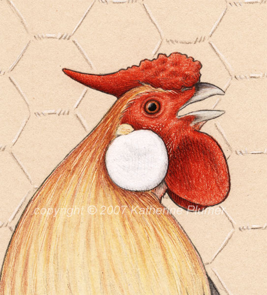
Finished the on-paper chicken drawing, expect the digital version next week some time (that one's cooler, I think). I hadn't originally planned to "finish" this drawing so... yeah. I'll go ahead and enter it.
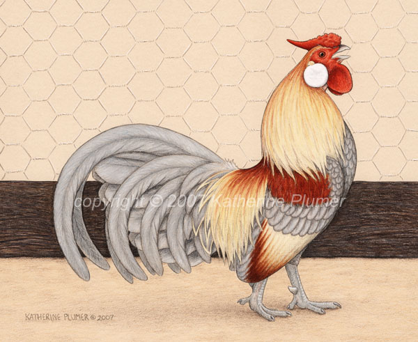
"Barnyard Gem"
9x11 inches
colored pencil, graphite, ink
on tan Stonehenge paper
price TBD
detail:
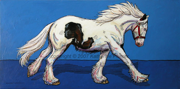
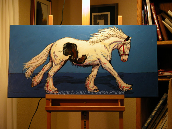
I've been round and round with that Gypsy painting. There are so many layers of paint you can't even see the canvas texture anymore! This morning I redid the background a gradation from turquoise to dark bluish purple. VERY pretty, but I was just totally unsatisfied. It was too... nebulous I guess. I liked the color but the horse needed to be somehow more grounded. So... I redid it again, this time a two-tone flat blue. Bits of turquiose can still be seen (which I like) and bits of red may end up showing around the edges (I may or may not like, we'll see). I've pretty well obscured the horse, so I'll need to redraw some things tomorrow.. I may end up wishing I'd restarted, but I hope not!

"Barnyard Gem"
9x11 inches
colored pencil, graphite, ink
on tan Stonehenge paper
price TBD
detail:

I've been round and round with that Gypsy painting. There are so many layers of paint you can't even see the canvas texture anymore! This morning I redid the background a gradation from turquoise to dark bluish purple. VERY pretty, but I was just totally unsatisfied. It was too... nebulous I guess. I liked the color but the horse needed to be somehow more grounded. So... I redid it again, this time a two-tone flat blue. Bits of turquiose can still be seen (which I like) and bits of red may end up showing around the edges (I may or may not like, we'll see). I've pretty well obscured the horse, so I'll need to redraw some things tomorrow.. I may end up wishing I'd restarted, but I hope not!

